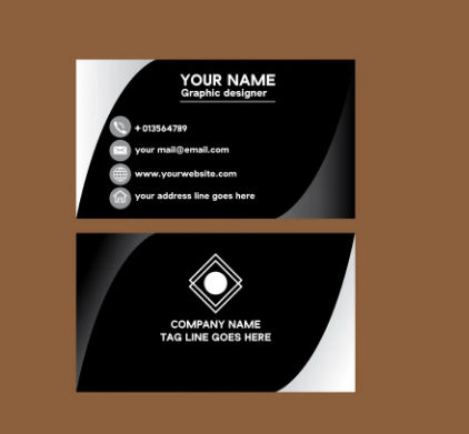
- CHOOSE THE RIGHT FORMAT
Before starting to design the business card for your business, the first thing will be to choose the most appropriate format, and by this, we are referring to picking the size of the card, commercial fonts as well as its orientation, which can be horizontal or vertical.
The standard and most used size are business cards of 85 x 55 millimeters, which is undoubtedly the most efficient and the most convenient for customers since they will be able to store them comfortably in a conventional card holder, which increases the chances that don’t end up in the trash.
- WHAT DATA SHOULD APPEAR ON YOUR BUSINESS CARD?
As we have just commented, when designing your business card, you must incorporate data that is really important to the public, that will help you convey the image and values of your business, and also give the essential information.
That said, one of the mistakes you should avoid is creating an excessively busy business card that displays information everywhere since, in this way, the only thing you will achieve is to complicate its reading and understanding and general confusion.
- LOGO: YES, OR NO?
Many people doubt whether to incorporate the company logo on the card, and our recommendation is to mix it without making it excessive. This means that to include the logo, the card must have enough space for it.
By incorporating the logo into the card, you will ensure that it will be much more recognizable at a glance, being able to identify the business at first glance.
- ESTABLISH A HIERARCHY
When you are clear about the format and the data you will incorporate in the business card, the next thing will be to establish a hierarchy that allows you to distribute the data in the most transparent and efficient way possible.
One of the most critical points when making business cards is to present the data with order and meaning, and for this, the most effective thing is to group the data according to its nature: personal data, contact data, social networks, etc.
- THE IMPORTANCE OF TYPOGRAPHY
When designing business cards, typography will be essential to facilitate data legibility, which must be clear and straightforward, and large enough to read without too much effort. You may consider sans serif fonts.
Also, our recommendation is that you do not use more than two different fonts on the same card. Otherwise, you risk creating confusion and moving away from your brand values.
Keep in mind that this is a business card and not a trailer for a Hollywood movie and that the most important thing is the data. This means that it is best to opt for discreet fonts since it is proven that they are the ones that work best, since they do not divert attention from what is most important.
- CREATIVITY
Although it is true that the key to the success of a business card lies in simplicity, order and clarity, it is also true that a creative touch that allows us to add something different from the rest is always appreciated.
When it comes to giving a creative touch to your card, choosing the type of paper is very important since it is undoubtedly one of the most differentiating aspects.

